How Much Information is Too Much on Your Online Portfolio?
In the fast-paced world of software development, your online portfolio serves as the digital face of your professional identity. However, the quest for the perfect balance between showcasing your skills and overwhelming visitors with information can be a challenging one. Much like a carefully crafted dish, your online portfolio requires the right blend of ingredients to leave a lasting taste. Too many details can overwhelm, diluting the impact of your accomplishments, while too few may leave your audience hungry for a more profound understanding of your capabilities. In this article, we'll explore the delicate art of balancing the content on your online portfolio and provide insights into optimizing it for success.
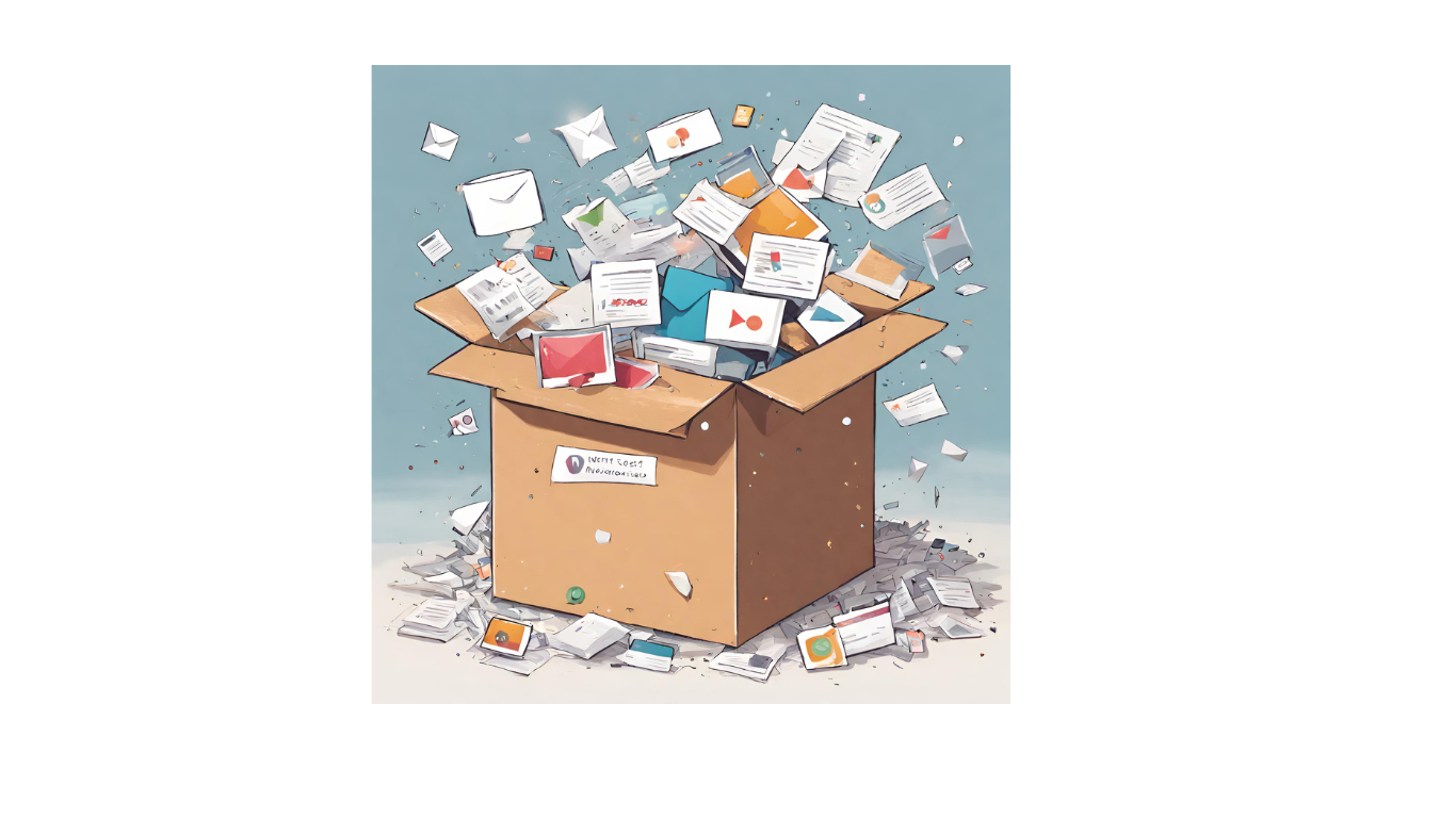
The Impact of Information Overload:
Too much information on your online portfolio can overwhelm visitors and dilute the impact of your key messages. Users often scan rather than read, and an overload of content may result in crucial details being overlooked. Additionally, a cluttered presentation can diminish the overall user experience.
Do this instead
Here’s a solution to avoid infodumping your portfolio with complex designs and content:
Prioritize Relevant Information
Start by identifying the key information that aligns with your career goals. Highlight projects, skills, and experiences that are directly relevant to the positions you're looking for. This focused approach ensures that every piece of information serves a purpose, eliminating unnecessary clutter.
Utilize Concise and Engaging Text
Choose a concise and engaging text that communicates your message effectively. Break down information into digestible chunks. Use bullet points, headings, and short paragraphs to enhance readability and allow visitors to quickly grasp essential details.
Visual Elements for Impact
Integrate visual elements strategically to complement textual information. Eye-catching images, infographics, and charts can convey complex information more efficiently than lengthy paragraphs. It would keep the potential employers stay on your portfolio a little longer and they’ll definitely remember you.
Organize Information with Clear Headings
Structure your online portfolio with organized sections and clear headings. This helps in easy navigation, allowing recruiters to find specific information effortlessly. An organized layout contributes to a positive user experience by guiding them through your portfolio in a logical sequence.
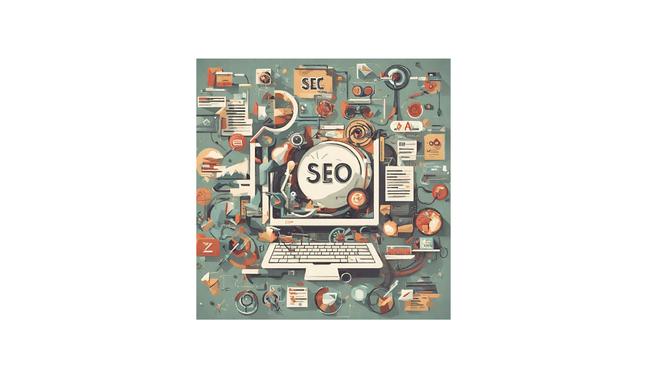
2. SEO is good- But not too much!
While SEO is a powerful tool for enhancing discoverability, its improper use can potentially lead to imbalances within an online portfolio. Here's why and how the use of SEO might cause an imbalance:
When SEO takes precedence over content quality, there's a risk of overemphasizing keywords. This can result in forced and unnatural language, making the content sound robotic or disjointed. Such an imbalance can detract from the overall coherence and readability of your portfolio.
Do this instead
To avoid using SEO overuse, we provide you the following solutions:
Keep it Simple
Prioritize natural language and meaningful content. Ensure that keywords are seamlessly integrated, enhancing rather than disrupting the flow of information.
Keep it Relavent
Focus on aligning SEO keywords with the genuine content of your portfolio. This ensures that your audience finds what they're looking for while maintaining content relevance.
Let us handle it
At Devswall, we are constantly working to improve the SEO structures of your online portfolio, so you can focus on your work. Join the waiting list at Devswall.com and let us take care of your market impression and online presence. Ge noticed among hundreds of other tech candidates.
3. Poorly structured visuals
The excessive use of visuals, especially irrelevant or generic images, can clutter your portfolio. It may create confusion and distract visitors from the core message you intend to convey. Furthermore, inconsistency in visual styles, such as using a mishmash of color schemes or conflicting design elements, can create a disjointed and unprofessional appearance.
Do this instead
Become a pro at designing a perfect portfolio by following these simple tips and tools:
Create a strategic flow
Incorporate interactive elements strategically. Whether it's clickable project demos or a dynamic timeline showcasing your career journey, these features can engage visitors without bombarding them with excessive information. This interactive touch can make your portfolio memorable.
Use online tools:
There are many online websites that provide well-thought templates to make your portfolio look professional like Github, Wix, and Devswall. If you have too much at hand or you’re new to this skill, let maestros handle the portfolio structure for you.
4. Exhaustive Project Details:
Providing exhaustive details for each project may overwhelm visitors. Too much technical terms can make it hard for non-experts to grasp your achievements. Very often, the hiring managers in companies are not necessarily experts in that field. Therefore, it is important to keep your online portfolio professional but also comprehensive for visitors.
Do this instead
To steer clear of complications in Past project details, we provide the following solutions:
Summarize the project
Offer concise project summaries, focusing on key outcomes and your role. Provide in-depth details selectively, allowing for a balance between depth and accessibility.
Create cohesiveness
Establish a standardized format for presenting project details, ensuring a cohesive and professional appearance. Clearly articulate the significance of each project, emphasizing the positive outcomes achieved. Additionally, ensure a user-friendly layout, making it easy for employers to explore and understand each project.
5. Desperate impression
An overwhelming number of contact details and social media profiles might create an impression of desperation, as if you're overly eager for attention. It's crucial to approach the inclusion of these details thoughtfully to strike a balance between accessibility and professionalism
Do this instead
To strike a balance between these elements you need to take care of following elements:
- Exercise Discretion
Prioritize essential contact information such as professional email and LinkedIn. Quality trumps quantity – focus on platforms directly related to your professional identity.
Conclusion
Finding the sweet spot for the amount of information on your online portfolio is an ongoing process. Prioritize the quality and relevance of your content, ensuring that SEO is a supporting element rather than the dominant force. Instead of falling into the pitfalls of visual mismanagement, focus on purposeful visual storytelling or let the experts do it for you. Strive for a thoughtful balance that enhances your professional image without overshadowing the skills and accomplishments showcased in your portfolio. Remember, your online portfolio doesn't have to be perfect, its a master piece in progress.